
Website Design & Marketing Agency
One Website that Works on Desktop,Tablet and Mobile
Tablet and Mobile
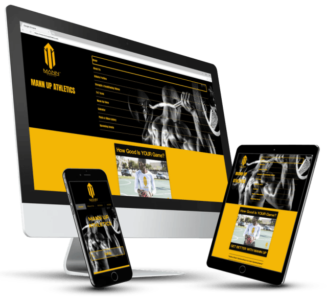
A website is now a must-have for doing business in today’s world, and it’s essential it looks great and works perfectly on desktop, tablet and mobile.
Traditional desktop-only sites simply won’t cut it anymore. One study from comScore found that 49 percent of digital media time is spent on mobile devices, with tablets accounting for an additional 12 percent. With just 31 percent of time left over for desktop devices, it becomes clear that websites should be built mobile-friendly, tablet-friendly, and desktop-friendly. That’s why we employ what’s called responsive web design.
Traditionally, responsive design means stretching and shrinking your site to fit different screen sizes. However, we take it a step further by tailoring different features for different devices as well. For example, a Click-to-Call button will appear on a mobile device, but not a tablet or desktop. The experience and the needs of a visitor can greatly differ between a mobile and desktop device, and at BarnesMobi we make sure that our content and designs consistently reflect that.
Website Design
Learn MoreWe Design Websites for Customer Engagement
FREE CONSULTATION
Send us your contact details and we’ll schedule a
1-on-1 with one of our professionals
Mobile-Friendly Websites and Captivating Design
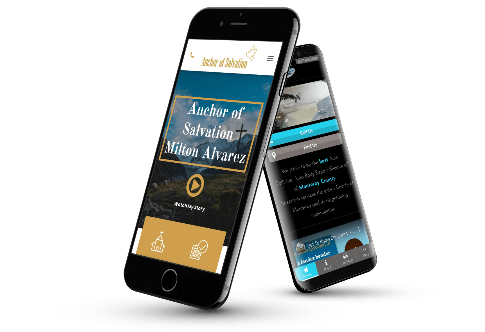
At BarnesMobi we create mobile-friendly websites that will captivate and engage with your visitors.
Creating a strong mobile web presence is critical to doing business in today’s world. Your customers are on the go and you need your site to look great on the small screen of a smart phone, be simple to use and provide all the information they’re looking for up front.